How to Boost E-commerce Sales with Simplified Navigation | Effective UX Design Tips
Category
Design
Date
26 July 2024
Ensuring that your customers can quickly and easily find what they need is crucial in the world of e-commerce. Just as a disorganised physical store can be frustrating, a cluttered online store can have the same effect. Simplifying navigation can greatly improve user experience, resulting in higher sales and happier customers. Let's explore how you can accomplish this.
Clear and Intuitive Menus
First things first, ensure that your navigation menu is clear and intuitive. Consider it as the roadmap to your store. Customers should be able to quickly and easily find their desired destinations. Use simple and descriptive labels for your categories and subcategories. Stay away from jargon or confusing terms – clarity is essential.
For example, instead of labelling a section “Apparel Heaven,” simply use “Clothing” or “Apparel.” This way, customers know exactly what to expect. Group related items together logically, and make sure your most popular categories are easily accessible from the main menu.
Sure! Here's the revised text:
Instead of labelling a section as "Apparel Heaven," use simple and clear terms like "Clothing" or "Apparel." This helps customers understand what to expect. Organise related items logically and ensure that your most popular categories are easily accessible from the main menu.
Breadcrumb Trails: The Path to Success

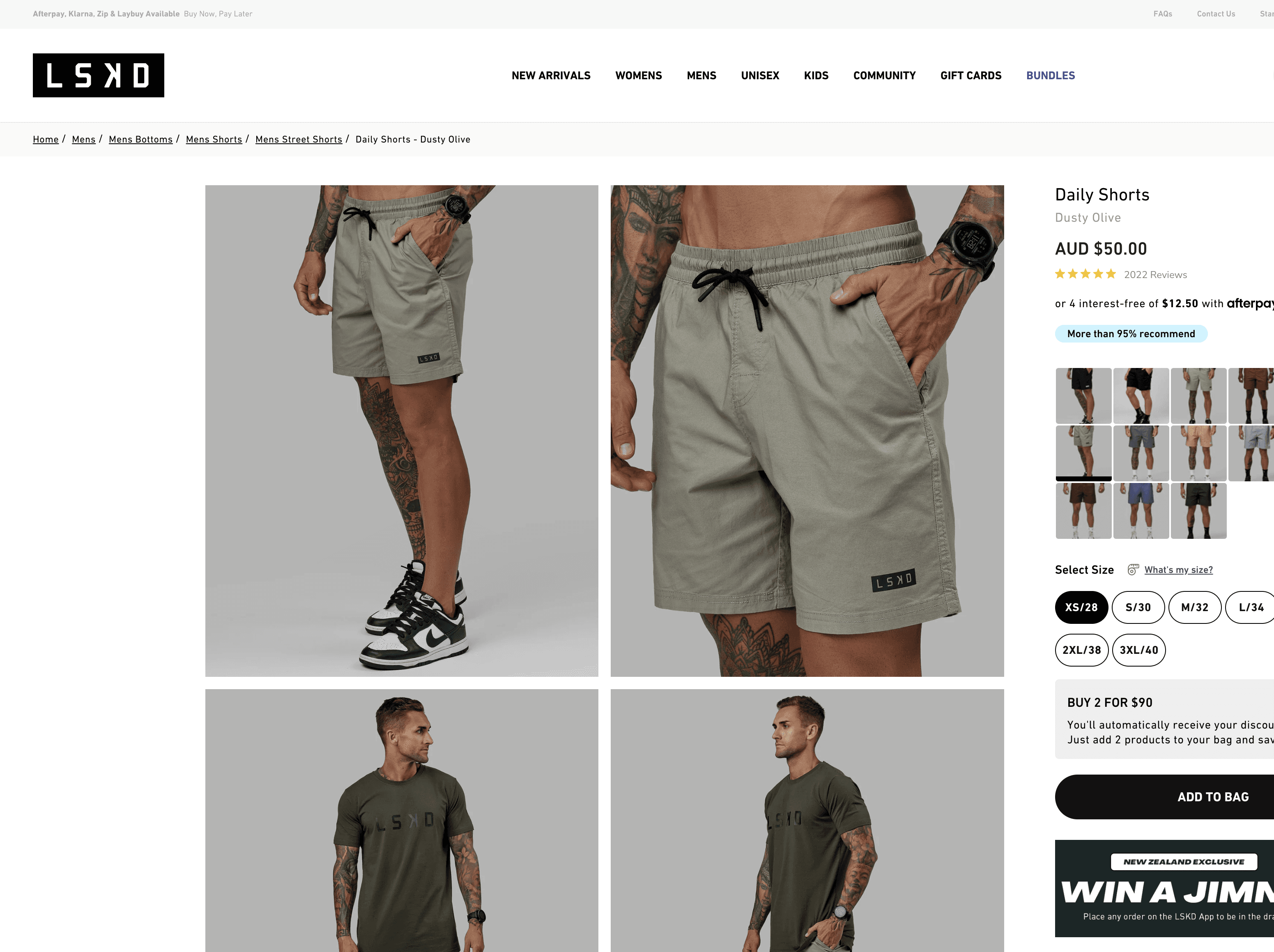
Breadcrumb trails are an excellent way to keep your customers oriented. These are essentially a secondary navigation aid, showing users their current location within your store and how they got there. For instance, a breadcrumb trail might look like this: Home > Mens > Mens Bottoms > Mens Shorts.
This not only helps users backtrack if they need to but also encourages them to explore other categories, enhancing their overall shopping experience. It's a small addition that can make a significant difference.
Dropdown Menus: More Options, Less Clutter
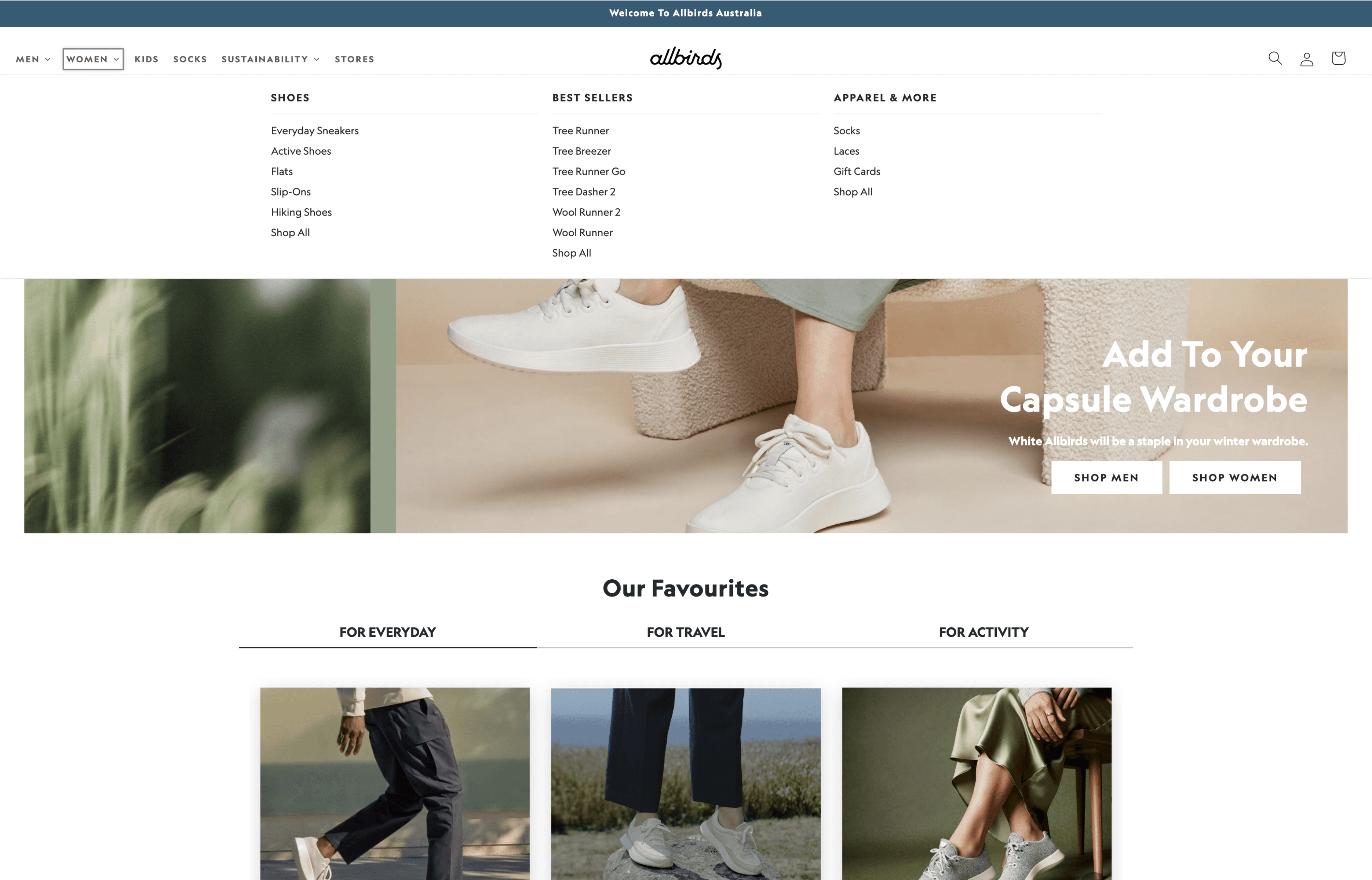
Dropdown menus can be a lifesaver for extensive inventories. They present multiple options without cluttering the main navigation bar. However, there’s a balance to strike – too many dropdowns can overwhelm users.
Remember to keep your dropdown menus well-organised and limited to essential categories. Make sure they are easy to navigate on both desktop and mobile devices. Thoroughly test them to avoid any frustrating hover issues, especially on mobile devices where touch precision can be tricky.
Search Functionality: The Ultimate Shortcut
Sometimes, customers know exactly what they’re looking for. In such cases, a robust search functionality is essential. Place your search bar prominently - it’s often the first thing experienced online shoppers will seek.
Make sure your search feature is fast and accurate. Implement auto-suggestions and error tolerance (e.g. correcting typos) to significantly improve user satisfaction. If possible, include filters in search results to help users narrow down their options quickly.
Consider Making Product Categories the First Level of the Main Navigation
Consider making product categories the first level of the main navigation. Having categories exposed by default benefits users as it allows them to understand the scope and content of the product catalogue quickly. Avoid including non-product navigation in the main navigation menu to prioritise top-level categories. Instead, consider using a secondary courtesy navigation menu, dropdown menus, and the homepage to feature additional non-product navigation elements. Note that small catalogue sites can condense product categories into a single access point without causing navigation issues, but the menu must be well-organised.
Consistent Design: Familiarity Breeds Comfort
Consistency is crucial in UX design. Ensure that your navigation elements are consistent across all pages. This means using the same menu style, layout, and labels throughout your site. When users know what to expect, they can navigate more confidently and quickly, leading to a more pleasant shopping experience.
Conclusion: Navigating Towards Success
Simplifying navigation is not just about making things look tidy; it’s about creating a seamless and enjoyable journey for your customers. Clear and intuitive menus, breadcrumb trails, well-organised dropdowns, and robust search functionality are all tools in your arsenal to enhance user experience and boost sales.
Remember, a happy customer is a loyal customer. By investing in simple and effective navigation, you're paving the way for greater satisfaction and returning customers. So, take a moment to assess your current setup and identify areas for improvement. Your customers (and your profits) will appreciate it!


