4 tips for better dashboard design - Part 1
DAte
18 May 2019
Category
For the past few months, I have been designing a dashboard that allows the users to have an overview of crucial information that includes all critical data, shows trends, highlights risks which require users attention at one glance.
A useful dashboard can be a daunting thing to design. Based on my experience during this project, I have put a list of tips to help you in the future.
In this article, I will explain the first 2 tips.
Use fewer borders
Separate visual from document hierarchy
Labels are the last resort (see Part 2)
Not all elements need to be fluid (see Part 2)
Let’s get to it.
Tip 1: Use fewer borders
When you need to separate two elements, you will probably immediately think of borders.
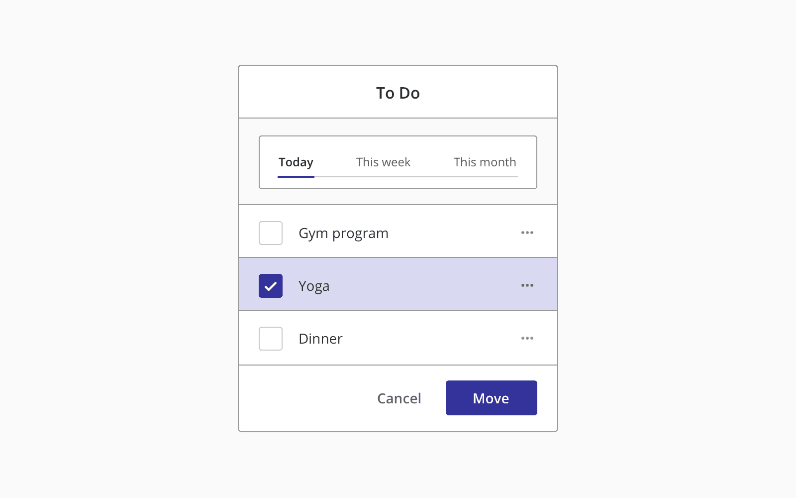
While borders can be useful to separate two elements, it could make your design too cluttered and busy.
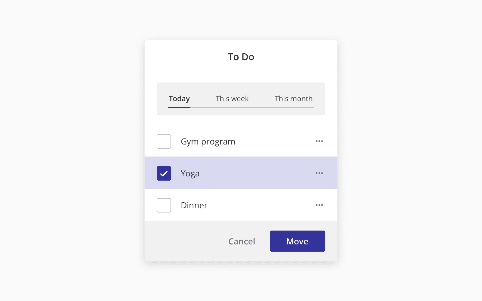
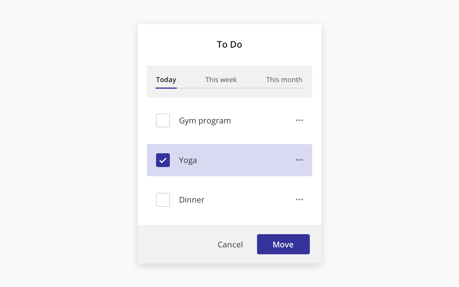
Use two different background colours.
You can use slightly different background colours to distinguish different adjacent elements.

Use drop shadow
Drop shadows do a great job to outline an element like a border would, and it would achieve the same result without being too distracting.
Use more spaces
By adding extra space, you can create a separation between elements.
Tip 2: Separate visual from document hierarchy
When you design and build a website, it is essential to keep the content hierarchy and semantic by using h1, h2, h3 and h4 tags on the headings that provide information about the meaning of the content of the text within them.
Generally, we give h1 large and bold font and h4 a small font size. This can be helpful for document styles like an article or report.
However, this may lead us to the wrong decision in the dashboard/application UI design.
Using h1 in the heading like Invoices to a page like below makes perfect sense in terms of making the page semantic, but we are trained to use a large font on the headings. It is easy to fall into a trap to make those headings larger and bolder than they should be.
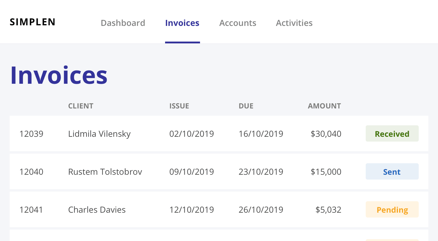
In many cases, the headings in application design act like labels rather than titles. They are more like supportive content and should not take all attention from the users. Notably, the target audience for the application is a daily (super) user, and we want them to focus on the content and data and serve them in the higher position, not to the headings. Hence, making the heading smaller makes a lot of sense in this scenario.
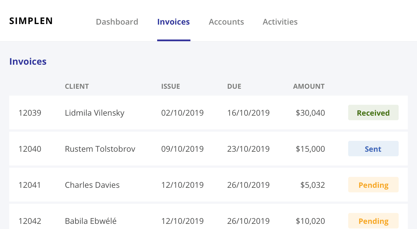
In this example, you might not even need to include the page heading because the menu indicates clearly which section you are currently on. You may want to add the heading tag for accessibility reasons but completely hide it visually because the navigation and content speak for themselves.
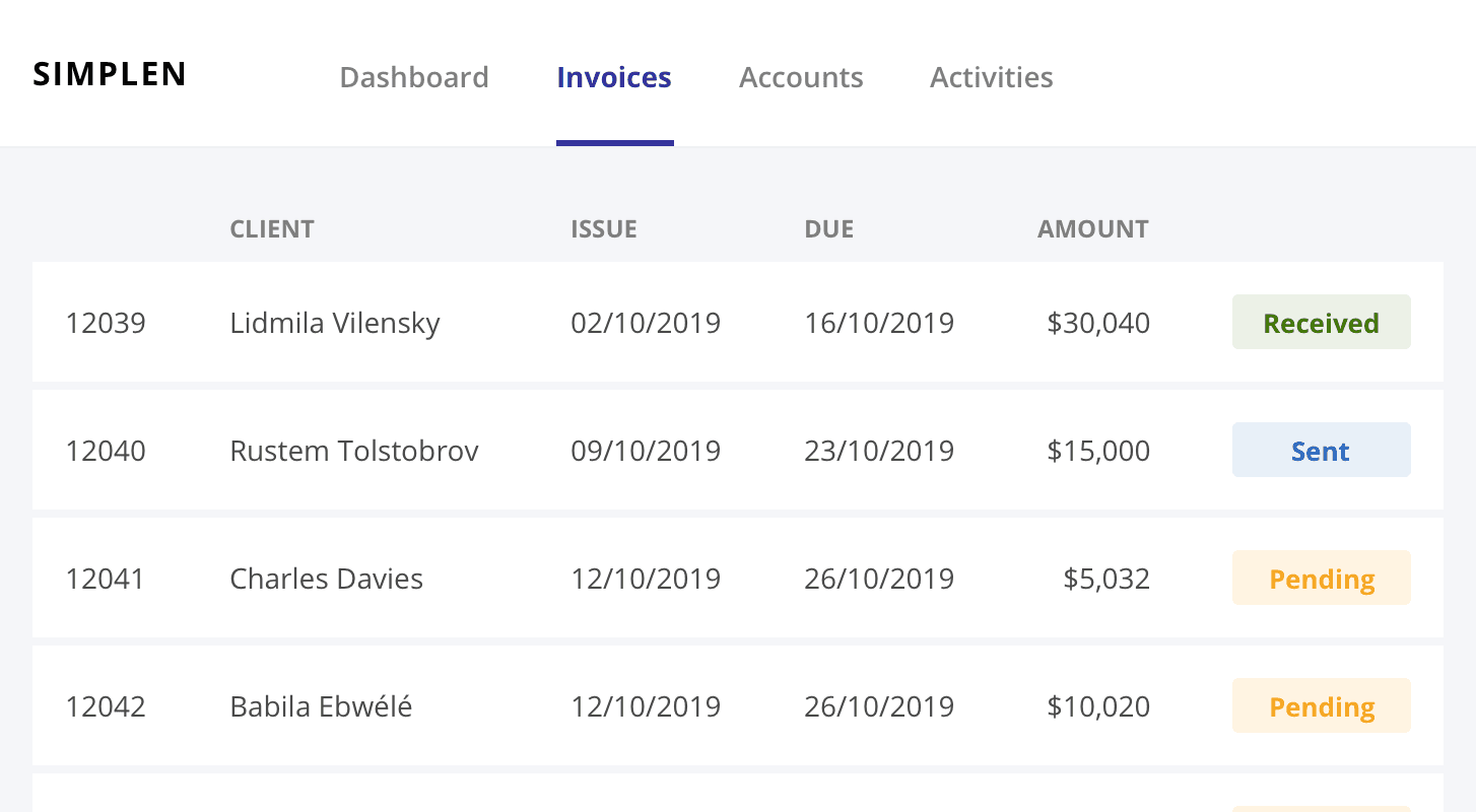
I learnt to try not to let the element influence how you style it. You should not only use the elements for semantic purposes but also consider suitable visual hierarchy when designing a dashboard or application.


