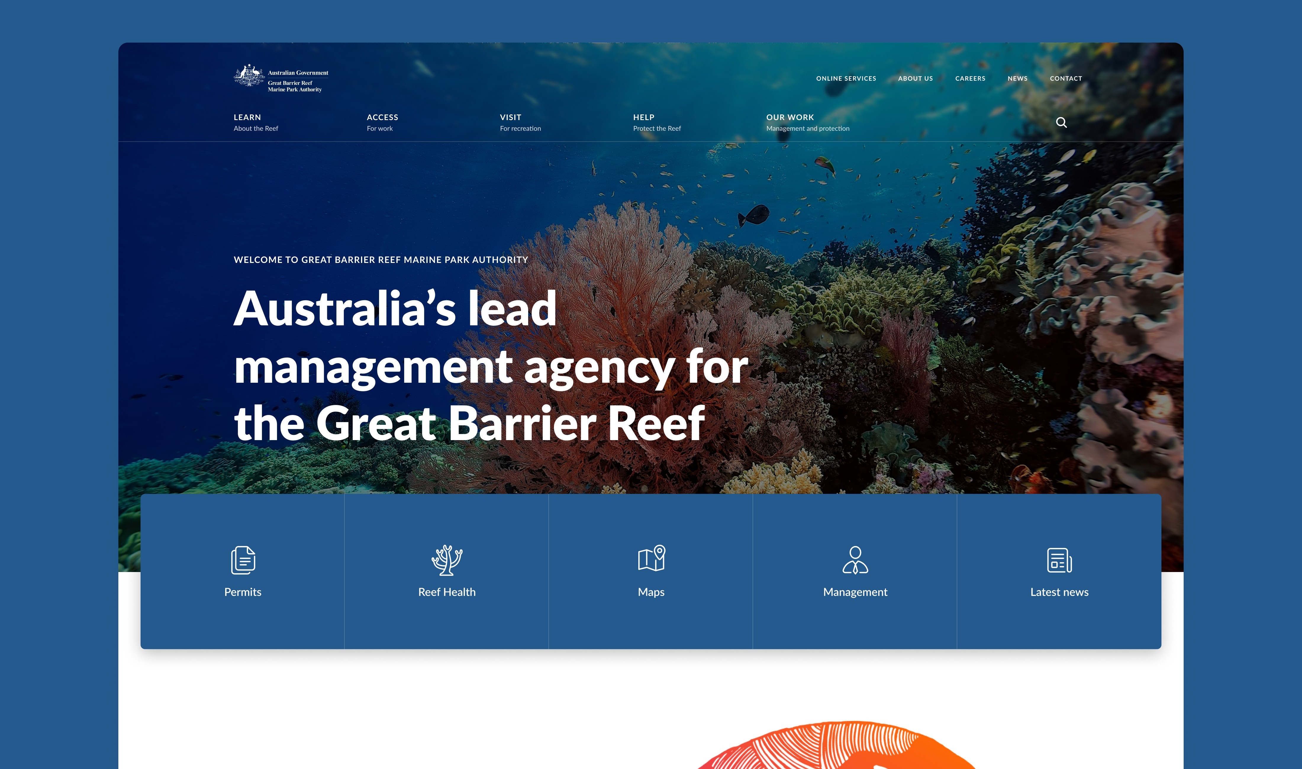
A digital gateway to the world's largest coral reef.

GBRMPA's website had grown into a sprawl of duplicated pages, buried content, and outdated navigation - making it hard for tourists, researchers, and operators to find what they needed. We restructured the information architecture and redesigned the site to make the reef's resources as accessible as they deserve to be.
Company
GBRMPA
Year
2022
Expertise
Design system
Web design
Web Design
Letting the reef do the talking.
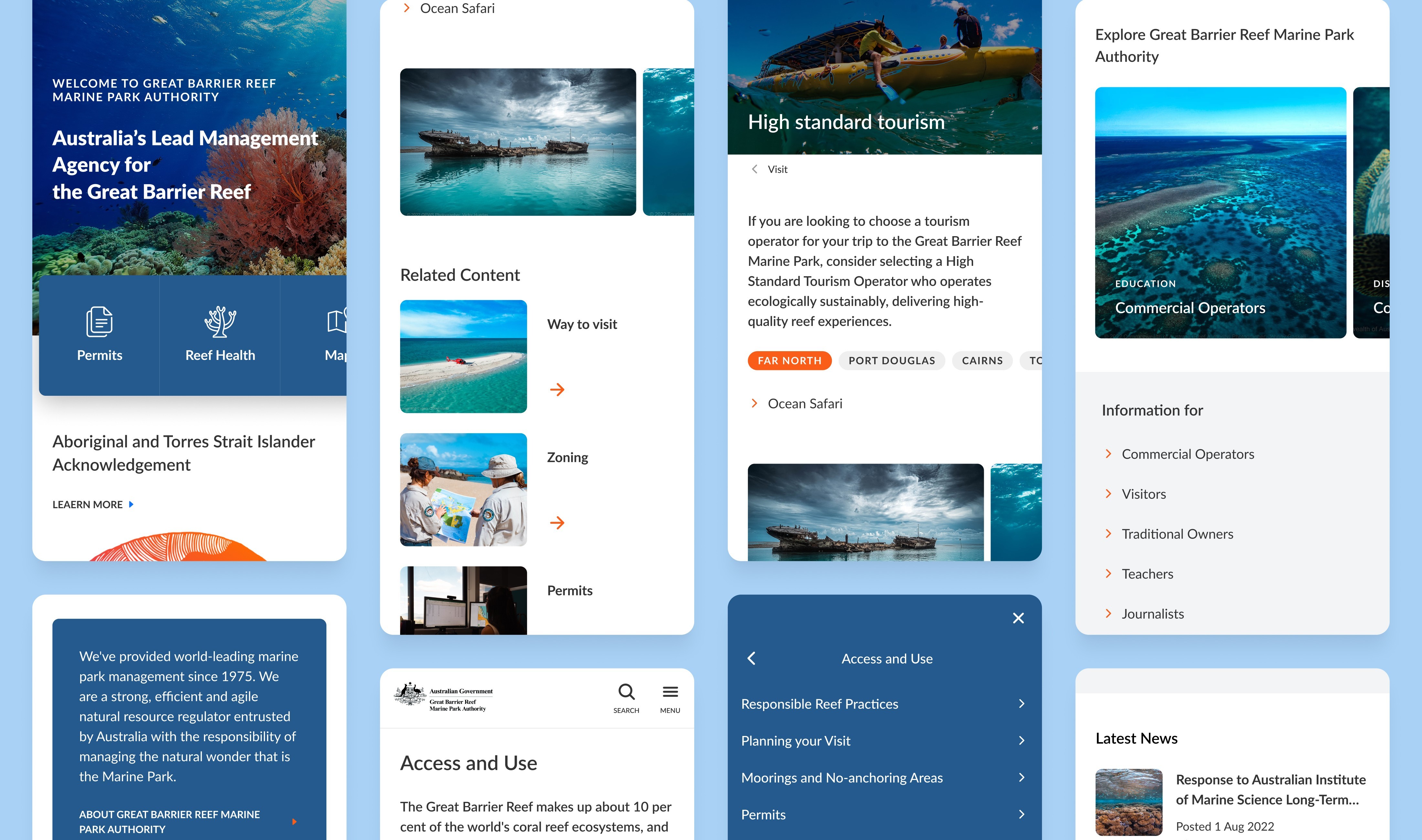
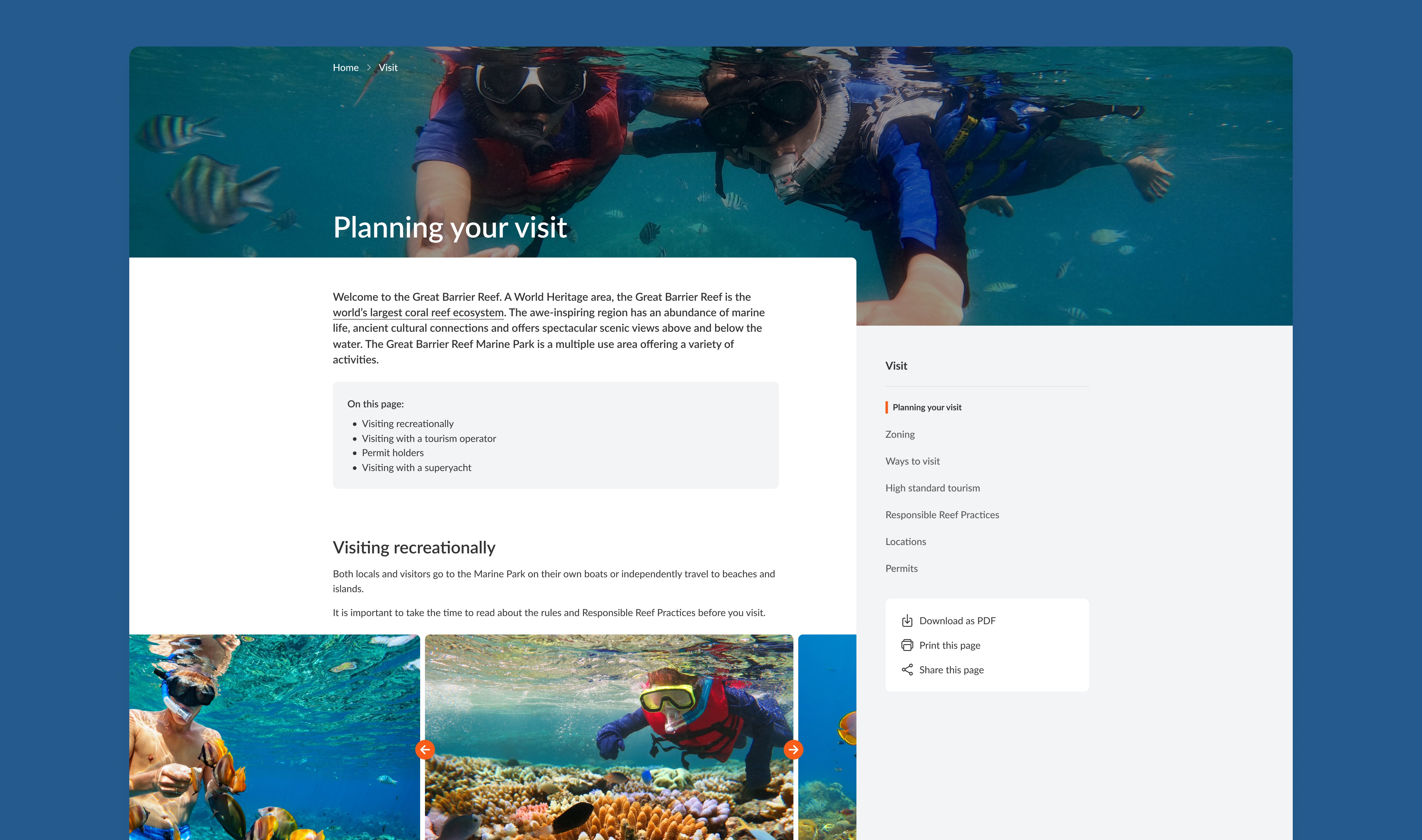
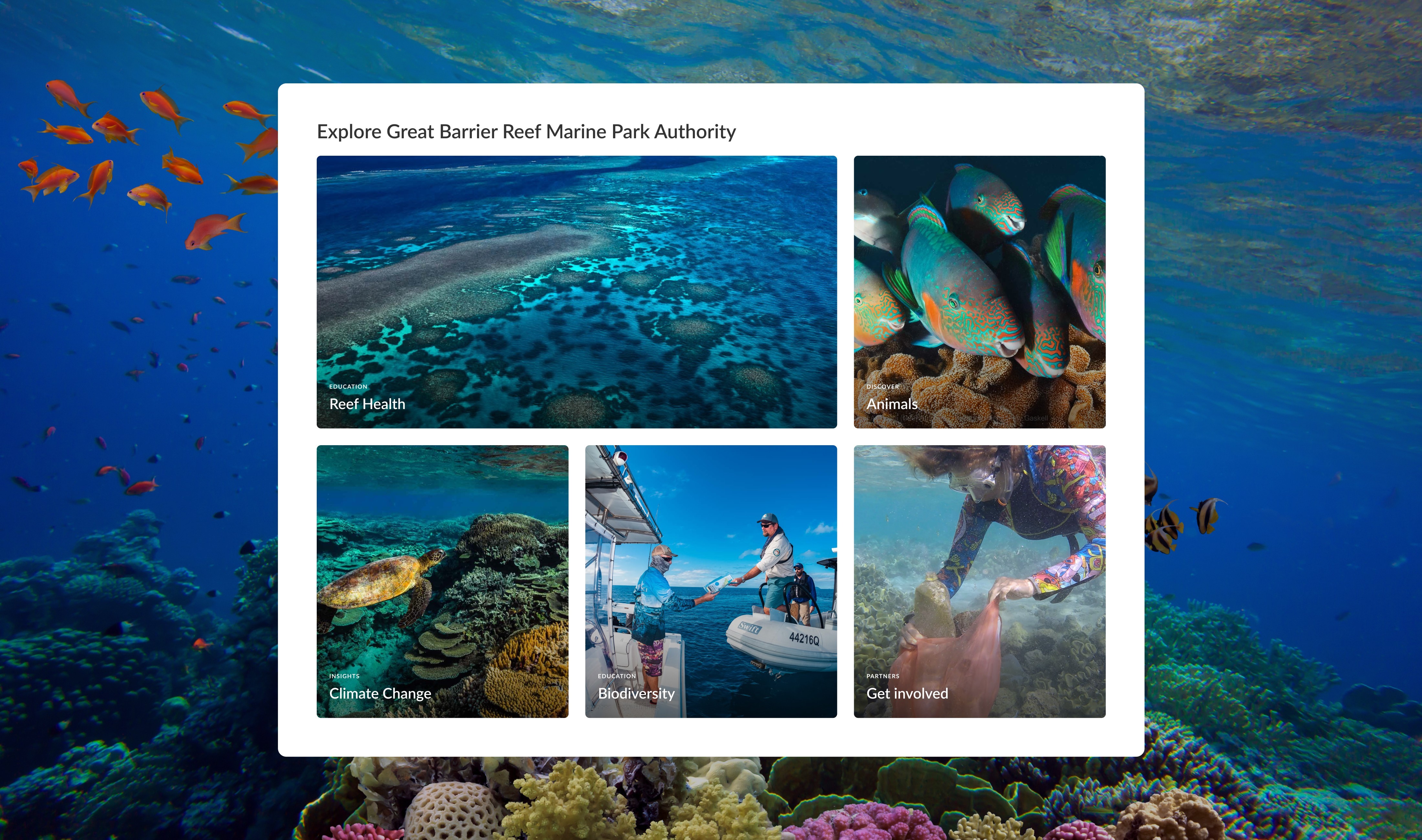
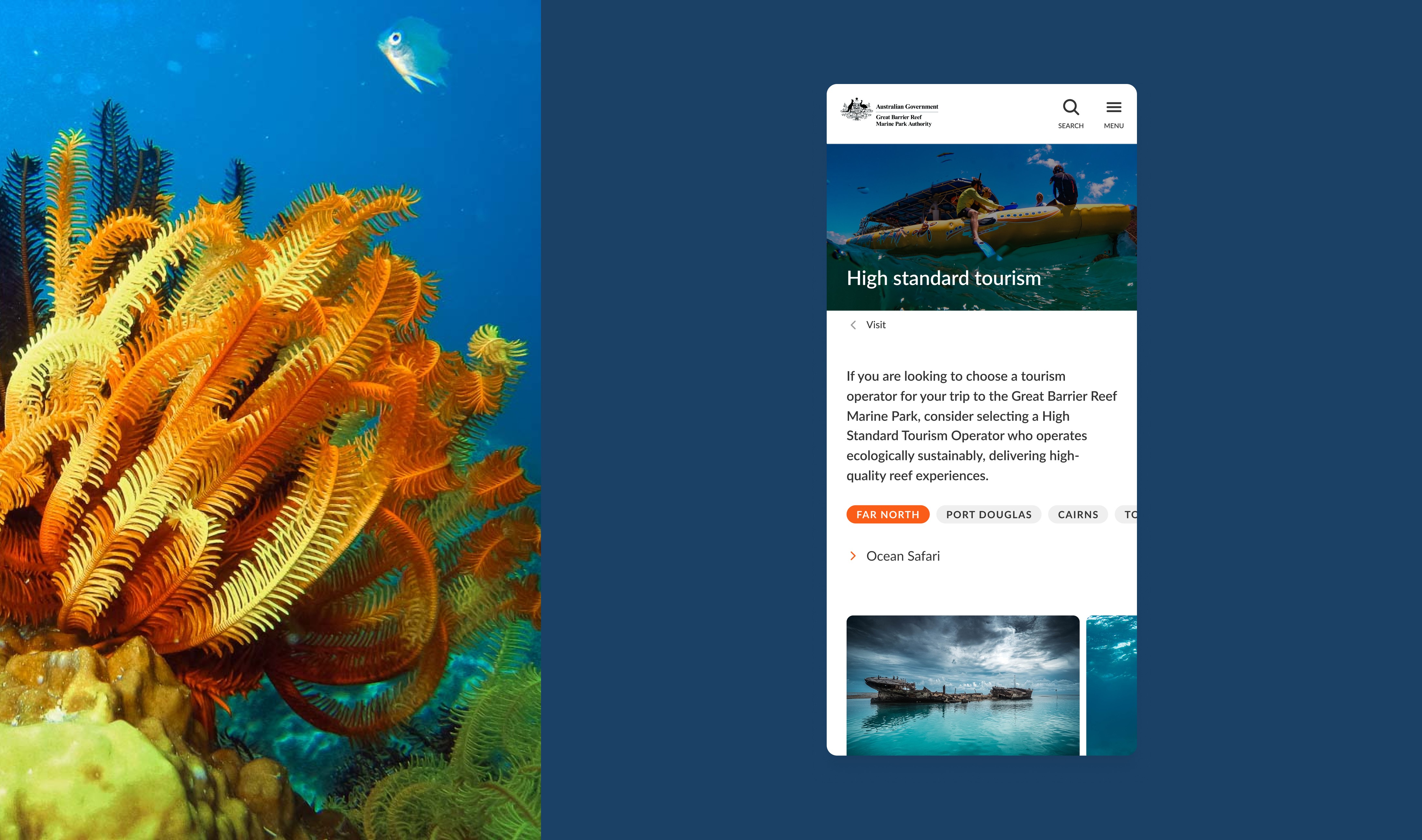
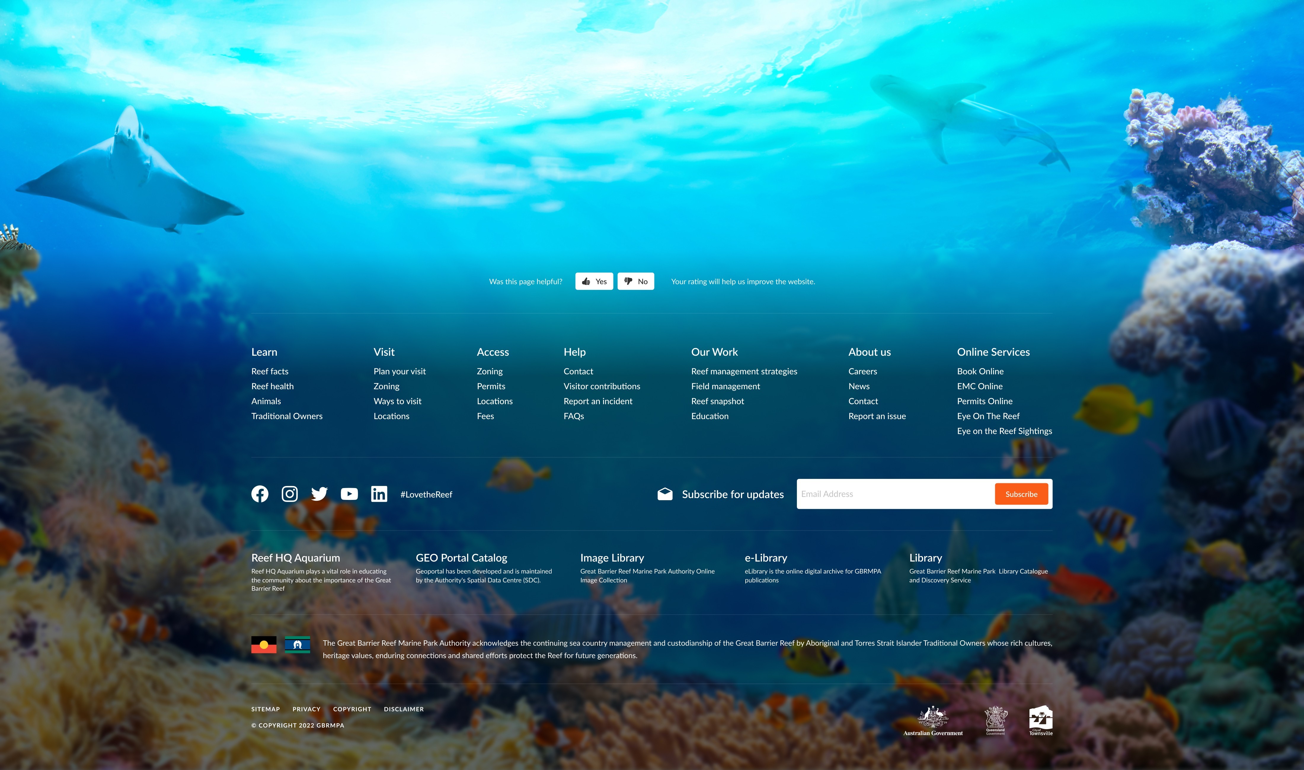
The old site buried stunning subject matter behind walls of text and cluttered layouts. We stripped it back and let the visuals lead - full-width imagery of reef life, clean typography, and clear pathways for the site's four main audiences: visitors, business operators, researchers, and educators. Key action links were surfaced so people could get to permits, zoning maps, and educational resources without digging through menus. Every page was designed mobile-first, since a large portion of traffic comes from people planning trips on the go.
Information Architecture
From hundreds of pages to a structure that makes sense.
Before any design work started, we mapped out the existing site and found years of content duplication, orphaned pages, and categories that no longer matched how people actually looked for information. We restructured the sitemap from the ground up, ran tree tests with real users to validate the new labels and groupings, and prioritised the pages that mattered most to each audience. The result was a leaner, more logical structure that the internal team could maintain without it drifting back into chaos.
The solution
A visual-led redesign on a logical structure.
We undertook a comprehensive discovery process to understand critical business needs and user requirements. The sitemap was restructured to prioritise crucial pages and identify optimal landing spots for traffic. We incorporated captivating visuals to highlight reef life, tourism, and educational content. Information architecture was reviewed, and tree testing was conducted to refine site structures, categorisation, and labels. Frequently used action links were surfaced for quick access.
Impact
Navigation with defined paths for four distinct audiences
Redundant pages after sitemap consolidation
Access to permits, zoning maps, and key resources
Structure tested with real users through tree testing
The outcome
Content that's easy to find and manage.
The redesigned website significantly improved user experience, with enhanced content findability and streamlined navigation. Efficient site management became possible, reducing redundancy and maintenance efforts. Visitors and business operators can now seamlessly explore commercial, research, tourism, and educational resources. The new, visually stunning platform successfully engages and informs global audiences, celebrating the reef’s complexity and beauty.
