Delicious delivered
Redesigning meal kits for effortless, inspired cooking experiences
Company
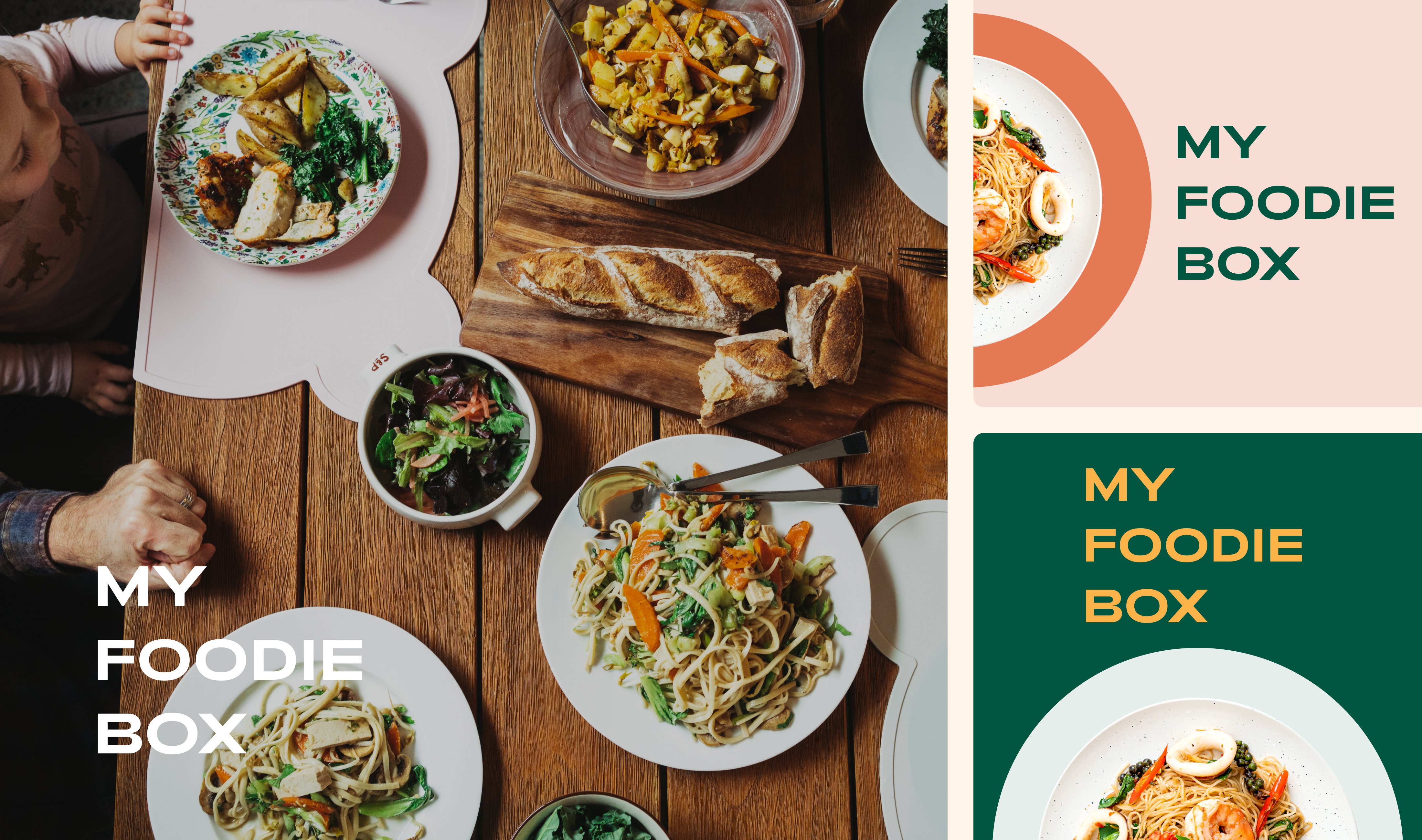
My Foodie Box
Year
2023
Expertise
Product UX/UI Design
Custom Web Design
Design System
01 Overview
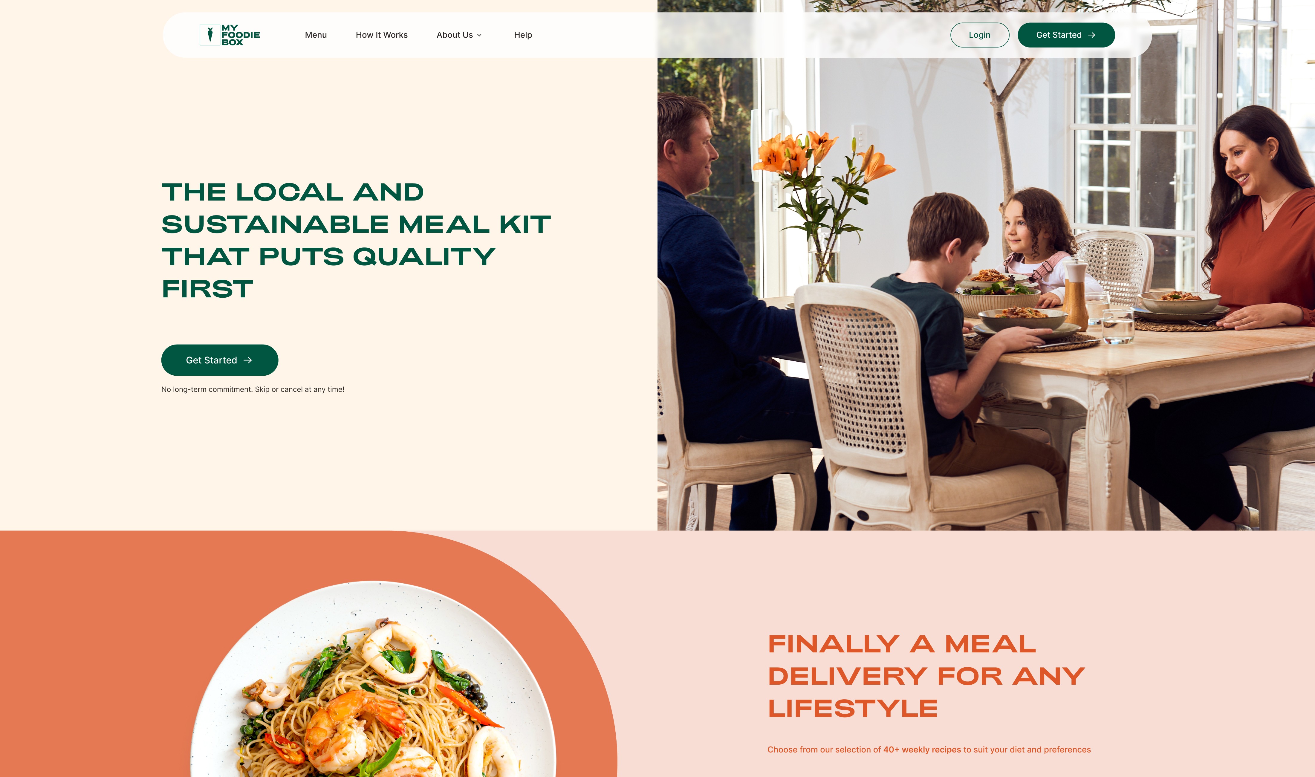
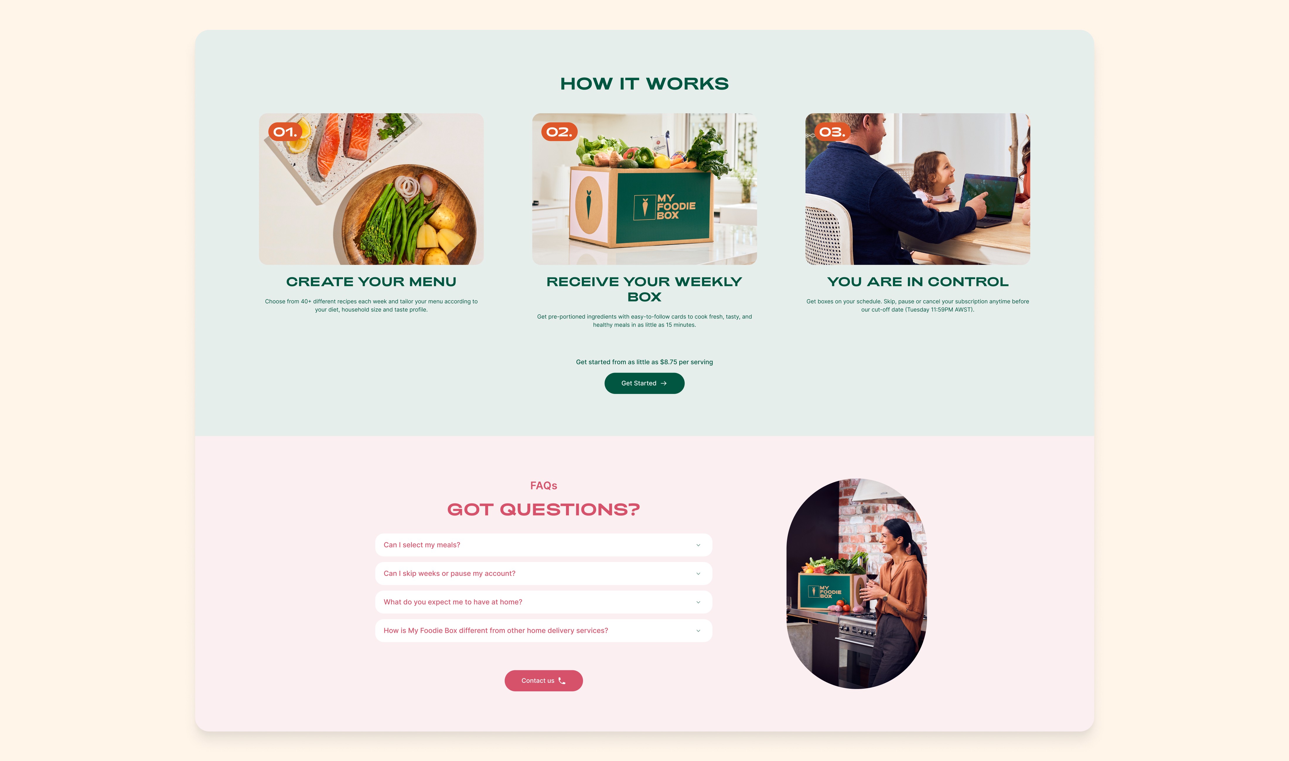
My Foodie Box is a Perth, Western Australian-owned and operated meal kit service.
Their weekly eco-friendly boxes contain locally sourced ingredients with recipes that must be cooked by hand by the customer using the pre-ordered menus included in the box.
02 Challenge
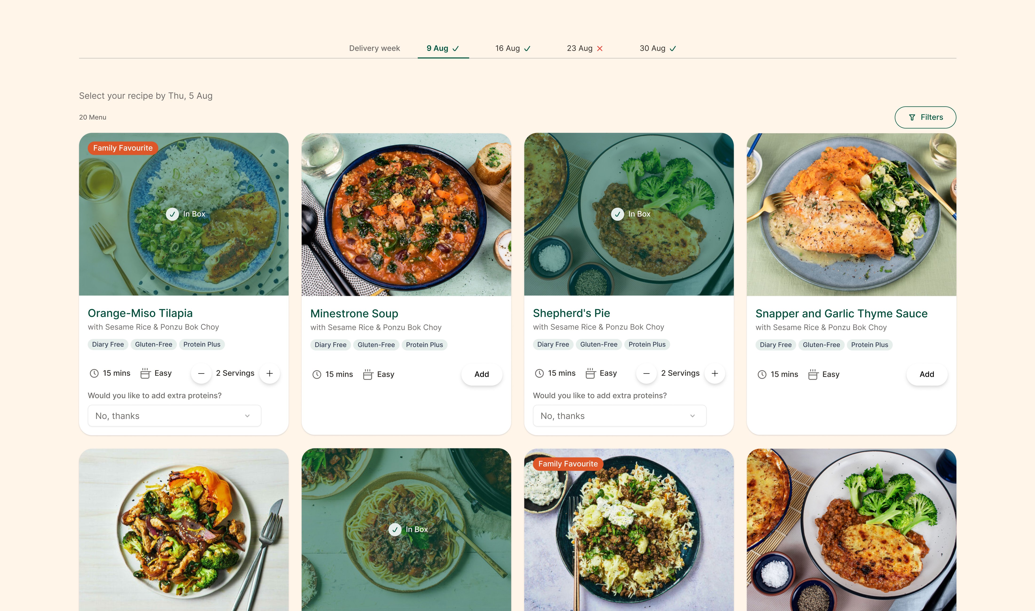
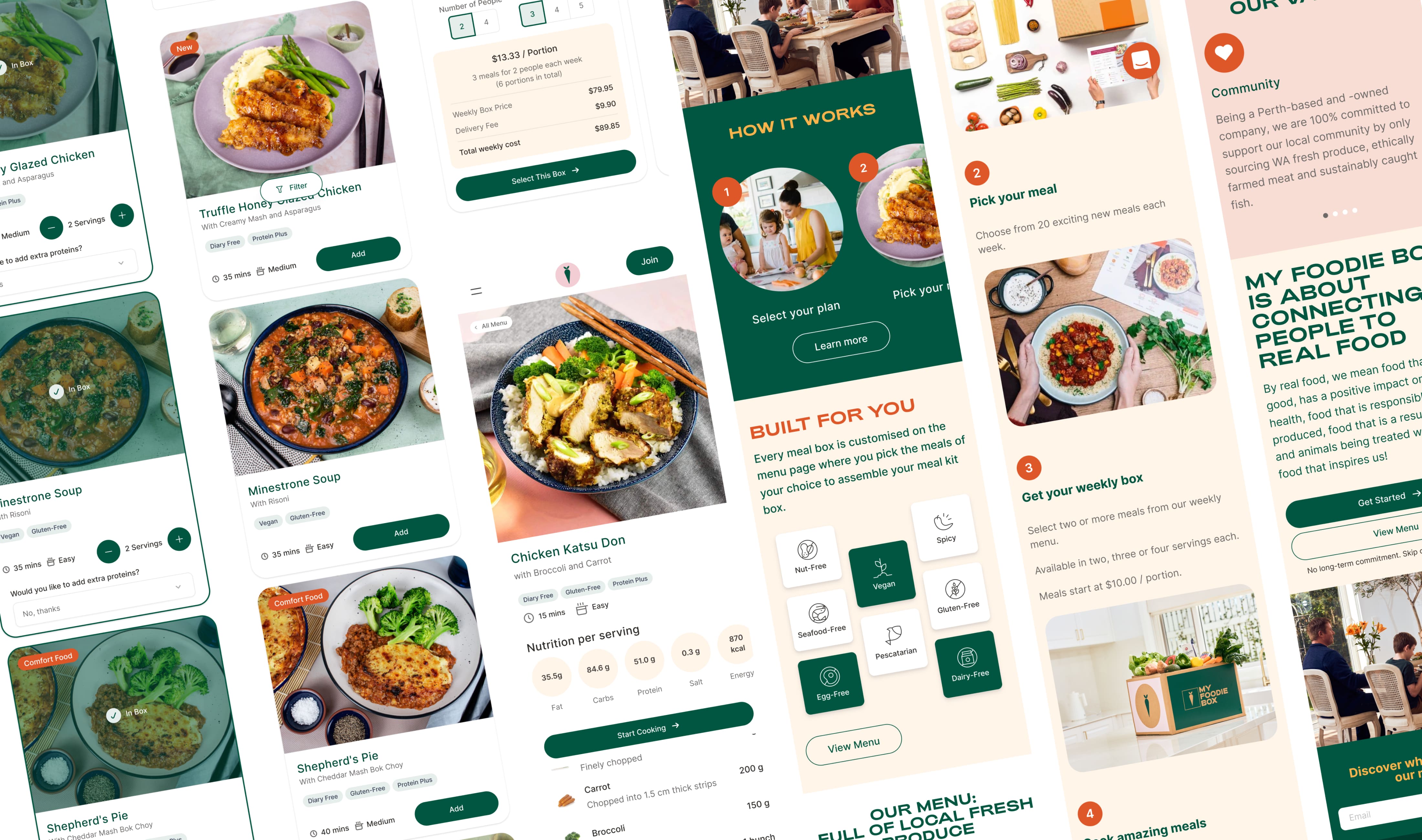
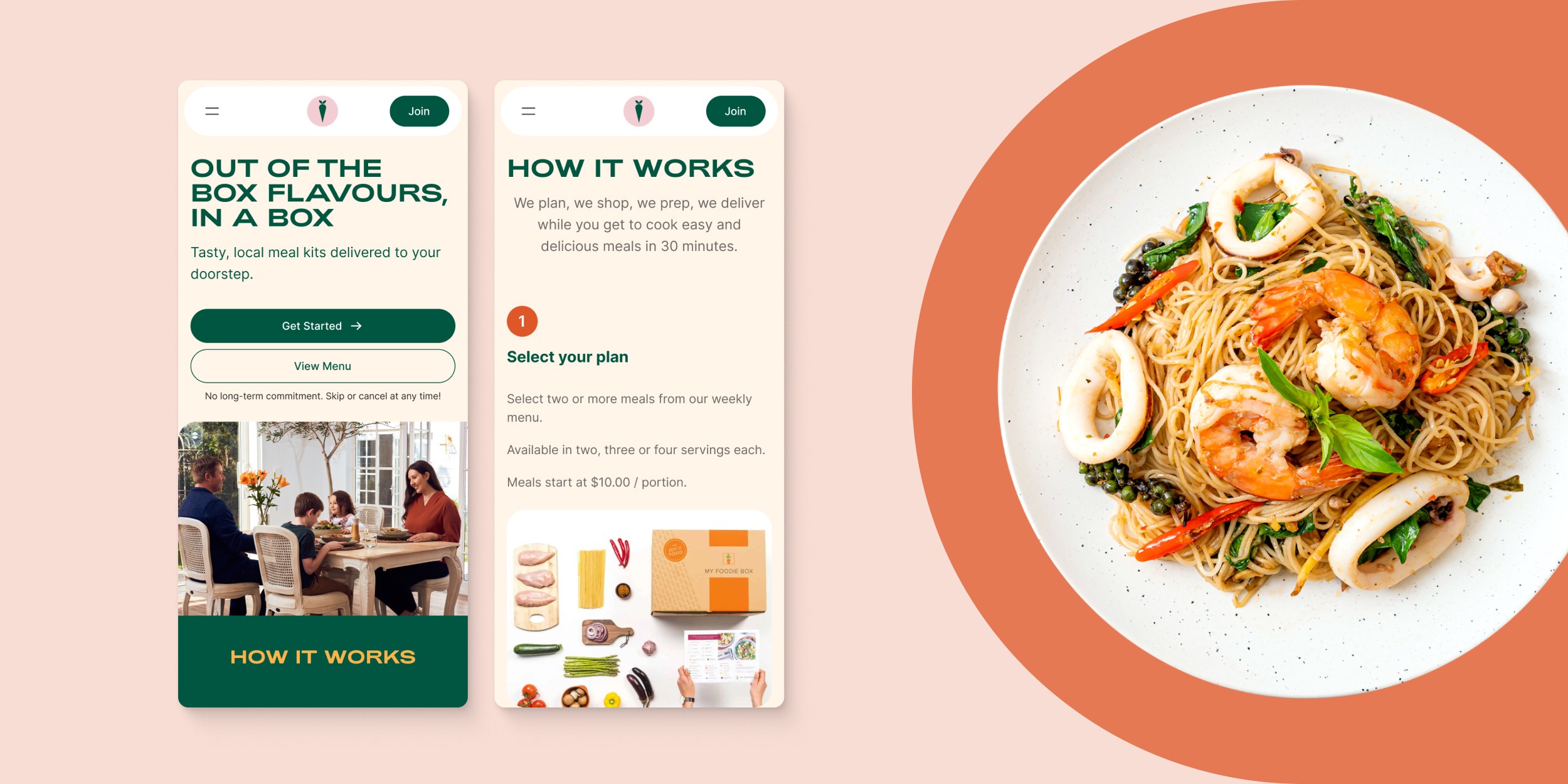
My Foodie Box faced issues with user navigation, account updates, and the sign-up process. Members struggled to find order pages, and updating account details was difficult, causing frustration and increased support calls. Potential customers discovered late in the sign-up that delivery was unavailable in their area and faced unexpected delivery fees. With 72% of users on mobile, poor mobile optimisation caused further frustration and lowered conversion rates. UI inconsistencies also added to user confusion and maintenance challenges.
03 Solution
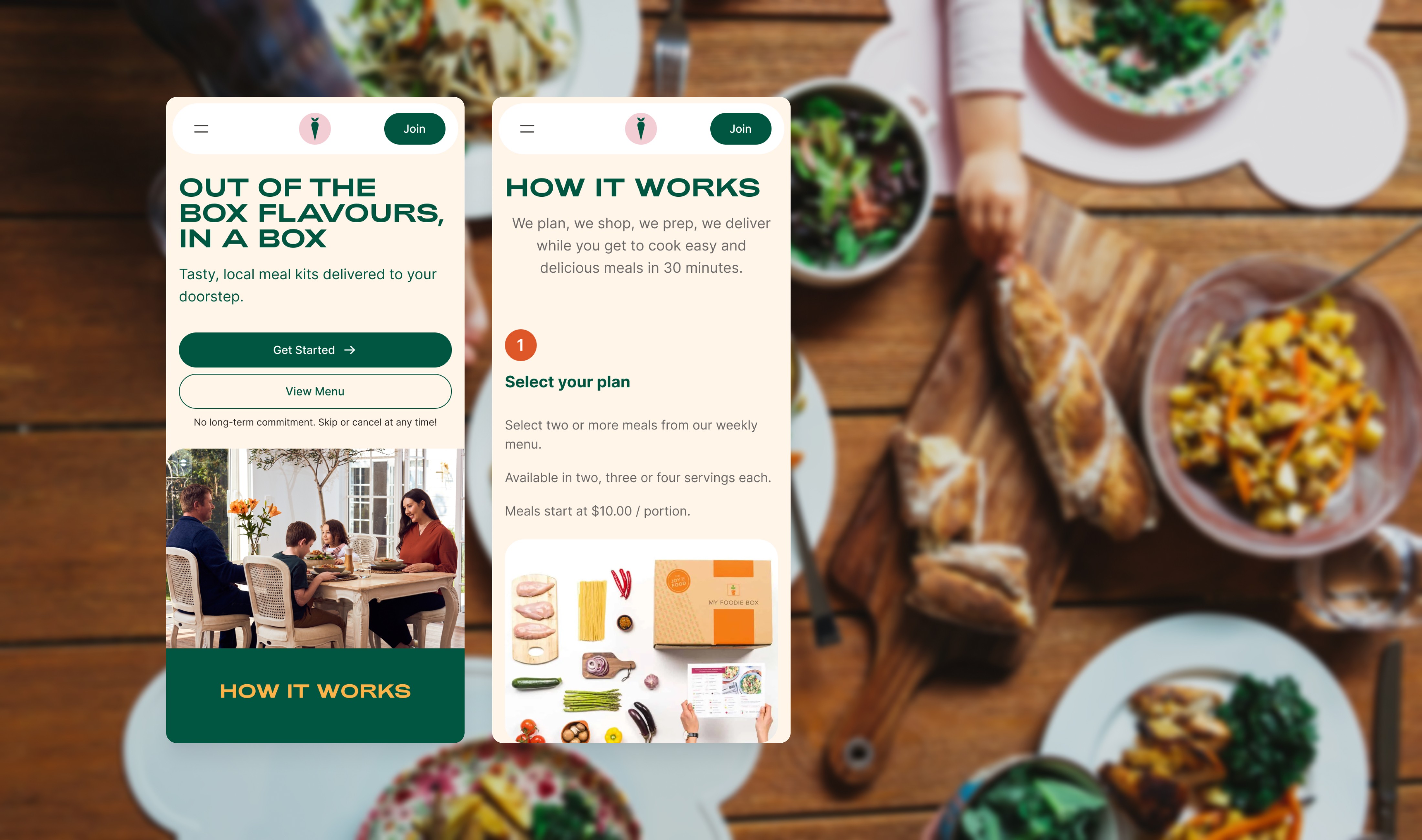
We redesigned navigation to separate member and visitor paths and streamlined the account update process. The sign-up was simplified to start with box selection, and delivery feasibility was checked early. Alternatives and notifications for future delivery availability were provided. The checkout process was split into steps, reducing cognitive load, improving error handling, and minimising scrolling, particularly benefiting mobile users. These changes aimed to enhance the user experience, reduce frustration, and boost conversion rates.
04 Impact
The improved navigation and account update processes eased user frustration and reduced support calls. The simplified sign-up and early delivery checks made the user journey smoother and more transparent. The split checkout process lowered cognitive load and error rates, significantly benefiting mobile users. These changes led to increased user engagement time and higher conversion rates, enhancing the overall user experience on the My Foodie Box website.